> For the complete documentation index, see [llms.txt](https://docs.realmacsoftware.com/elements-docs/llms.txt). Markdown versions of documentation pages are available by appending `.md` to page URLs; this page is available as [Markdown](https://docs.realmacsoftware.com/elements-docs/using-elements/components/navigation-and-interaction/navigation-standard.md).
# Menu
Build responsive navigation automatically from your site pages
The Menu component creates responsive navigation from the pages and folders in your Elements project. It supports a logo or site title, styled desktop links, dropdown submenus, a mobile trigger, and a configurable mobile menu.
### How to Use Menu
You’ll find Menu under **Navigation** in the Components list.
1. Drag **Menu** onto the page or a shared header.
2. Choose a Logo, site Title, or custom Dropzone.
3. Style the navigation items and their active states.
4. Choose when the mobile trigger appears.
5. Enable the mobile menu Preview while styling it.
6. Test desktop dropdowns and the mobile menu in a browser.
### Component Settings
#### Content Layout
**Width** offers Auto, Full, Screen, Breakpoint, or Theme Spacing. Breakpoint is the default; Theme Spacing reveals a value defaulting to 36.
**Height** offers the same modes and defaults to Auto.
**Gap** controls space between the logo and navigation and defaults to theme spacing 2.
#### Logo
**Link** sets the logo or title destination. When unset, it links to the site homepage.
**Type**
* **Logo** — Uses the site logo and shows Width, which defaults to 100.
* **Title** — Displays the site title. This is the default.
* **Dropzone** — Uses custom child content.
Title mode provides Color, Opacity, Font, Size, Text Shadow, Weight, Spacing, Italic, and Underline. Defaults include Text 50, 100% opacity, Body font, Extra Large size, and no shadow, italic, or underline.
**Margin** defaults to 0 on every side.
#### Font & Text Styles
**Alignment** positions navigation labels at Start, Centre, or End and defaults to Centre.
Font defaults to Body and Size to Base. Use Weight, Spacing, and Italic for the general text style.
Use **State** to edit Default and Active text colours, opacity, text shadow, and underline independently.
The **Background** state controls can apply a colour to Default or Active items. Each state offers None or Color. Padding and Radius apply around the navigation item.
#### Mobile Trigger
**Display** chooses when desktop navigation changes to the mobile trigger: on small screens, up to medium, up to large, up to extra large, or always. Up to Large is the default.
**Position** places the trigger first or last; Last is the default.
**Type** uses the built-in Hamburger or a custom Dropzone. Hamburger is the default and provides Default and Hover colours.
**Close Icon** controls its Top and Right offsets, both defaulting to theme spacing 8, plus separate Default and Hover colours.
#### Mobile & Sub Menus
**Preview** displays the mobile menu in Edit mode and is off by default.
**Position Type**
* **Uniform** — Uses one Inset value on every side.
* **Individual** — Uses separate Top, Right, Bottom, and Left values. This is the default.
Individual positioning defaults to 6 on Top, Right, and Left, with Bottom set to Auto.
**Animation** offers Slide Down, Slide Up, Slide Left, Slide Right, Fade, Zoom, or None. Slide Down is the default.
Set the panel Background, Opacity, Blur, Shadow, border Width, Color, and Radius. The Backdrop has separate Color, Opacity, and Blur controls.
**Desktop Dropdown** Padding defaults to theme spacing 2 on every side. **Vertical Item Spacing** also defaults to 2.
### How to Create a Sticky Menu
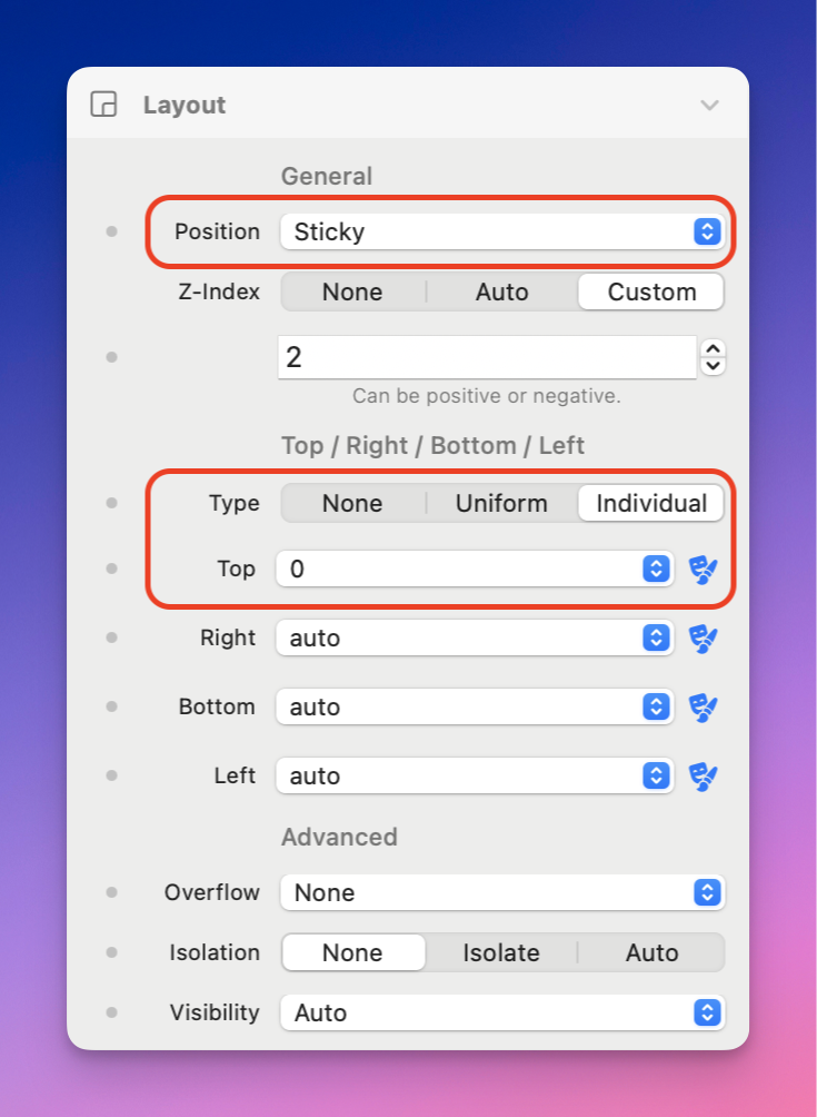
For a traditional sticky header:
1. Open **Layout → Position**.
2. Choose **Sticky**.
3. Set **Type** to Individual.
4. Set **Top** to 0.
A sticky Menu positioned at the top of the viewport.
Sticky remains in the normal document flow until it reaches the specified position. If an ancestor clips overflow or does not provide enough scrollable space, use Fixed instead. Fixed removes the Menu from normal flow and keeps it at the viewport position throughout scrolling.
### Accessibility
Use concise page titles, maintain visible active and focus states, and ensure the mobile trigger has sufficient contrast. Test every menu level with a keyboard and avoid placing essential links only inside hover interactions.
### Related Components
* [Breadcrumbs](/elements-docs/using-elements/components/navigation-and-interaction/breadcrumbs.md) — Shows the current page’s position.
* [Tree](/elements-docs/using-elements/components/data-and-organisation/tree.md) — Builds expandable multi-level navigation.
* [Top Pages](/elements-docs/using-elements/components/data-and-organisation/top-pages.md) — Creates a simpler automatic list of pages.
| Common Control | Description |
| ------------------------------------------------------------------------------------------------------------------ | ----------------------------------------------------------------------- |
| [Link](/elements-docs/using-elements/components/common-controls/link.md) | Link to a page, resource, anchor, email address, or website. |
| [Layout](/elements-docs/using-elements/components/common-controls/layout.md) | Control positioning, stacking, visibility, overflow, and isolation. |
| [Sizing](/elements-docs/using-elements/components/common-controls/sizing.md) | Set width, height, and responsive size constraints. |
| [Spacing](/elements-docs/using-elements/components/common-controls/spacing.md) | Add responsive margin and padding. |
| [Typography & Text Styles](/elements-docs/using-elements/components/common-controls/typography-and-text-styles.md) | Control fonts, text spacing, decoration, colour, and semantic wrappers. |
| [Backgrounds](/elements-docs/using-elements/components/common-controls/backgrounds.md) | Apply colour, image, gradient, SVG, video, and hover backgrounds. |
| [Transitions](/elements-docs/using-elements/components/common-controls/transitions.md) | Choose what animates and set its timing curve, duration, and delay. |
| [Effects](/elements-docs/using-elements/components/common-controls/effects.md) | Apply shadows, opacity, and hover effects. |
| [Filters](/elements-docs/using-elements/components/common-controls/filters.md) | Apply blur, brightness, saturation, shadow, and backdrop effects. |
| [Transforms](/elements-docs/using-elements/components/common-controls/transforms.md) | Scale, rotate, move, and skew components. |
| [Borders](/elements-docs/using-elements/components/common-controls/borders.md) | Set border style, colour, opacity, width, radius, and hover states. |
| [Advanced](/elements-docs/using-elements/components/common-controls/advanced.md) | Add CSS classes and IDs, or change supported HTML tags. |
---
# Agent Instructions
This documentation is published with GitBook. GitBook is the documentation platform designed so that both humans and AI agents can read, navigate, and reason over technical content effectively. Learn more at gitbook.com.
## Querying This Documentation
If you need additional information that is not directly available in this page, you can query the documentation by asking a question.
Perform an HTTP GET request on the following URL with the `ask` and `goal` query parameters:
```
GET https://docs.realmacsoftware.com/elements-docs/using-elements/components/navigation-and-interaction/navigation-standard.md?ask=&goal=
```
`ask` is the immediate question: it should be specific, self-contained, and written in natural language.
`goal` is what the user is ultimately trying to achieve, the reason they need the answer. Sharing it helps GitBook give you a better, more relevant answer. A goal is most helpful when it describes the outcome the user wants rather than restating the question. For example, with `ask=how do I create an API token`, a goal like `automate deployments from our CI pipeline` lets GitBook tailor the answer to that use case.
The response will contain a direct answer to the question and relevant excerpts and sources from the documentation.
Use this mechanism when the answer is not explicitly present in the current page, you need clarification or additional context, or you want to retrieve related documentation sections.