> For the complete documentation index, see [llms.txt](https://docs.realmacsoftware.com/elements-docs/llms.txt). Markdown versions of documentation pages are available by appending `.md` to page URLs; this page is available as [Markdown](https://docs.realmacsoftware.com/elements-docs/using-elements/design-and-theming/theme-studio/border-radius.md).
# Border Radius
Manage reusable corner-radius values across your website
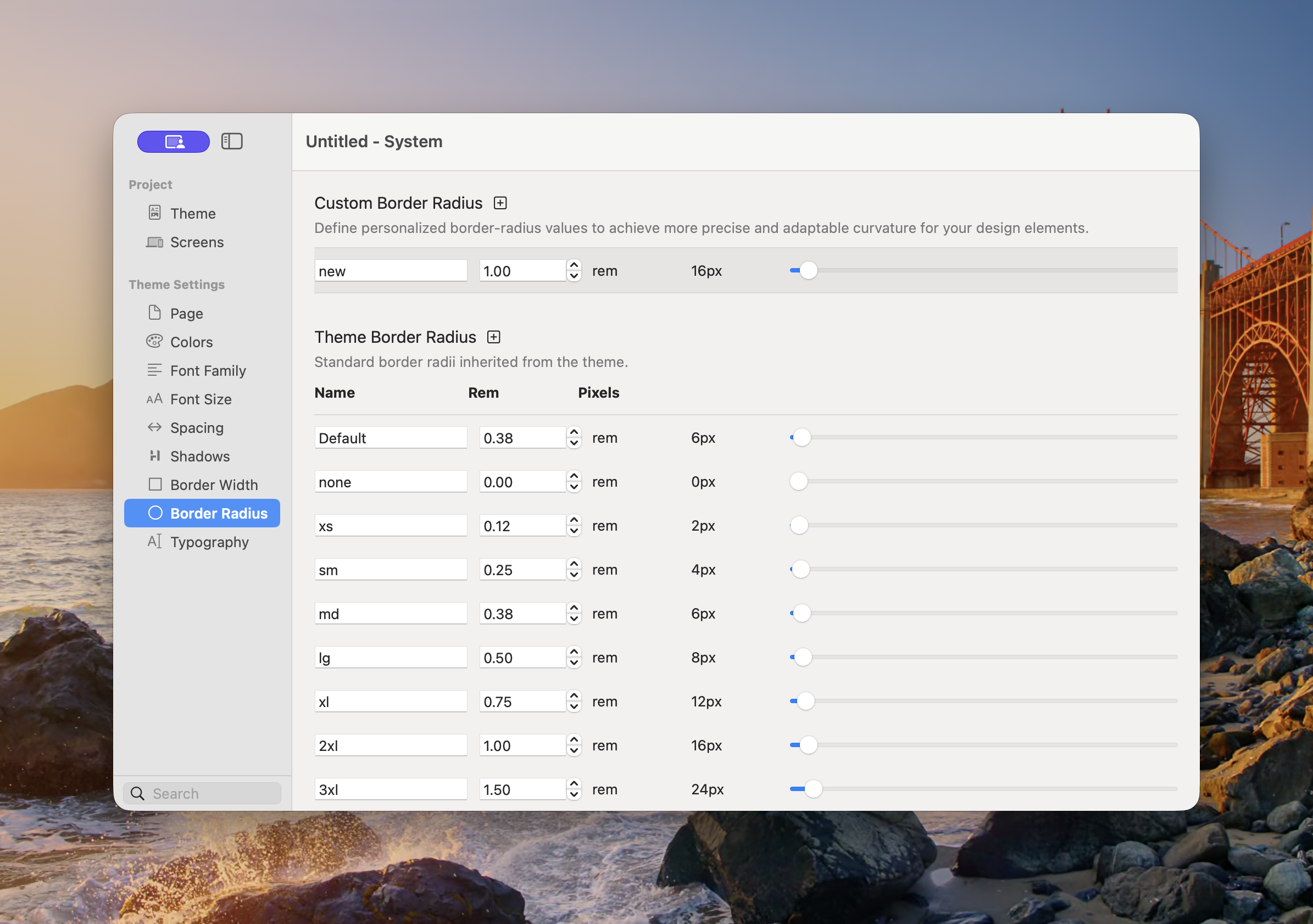
Border Radius controls the reusable corner shapes available to Components. A consistent radius scale helps cards, buttons, images, fields, and panels feel like part of the same design system.
The selected theme supplies a radius scale that can be customised for the project.
### Theme Border Radii
The standard scale contains:
* **Default** — The theme’s recommended general-purpose corner radius.
* **none** — Square corners.
* **xs**, **sm**, **md**, **lg**, **xl**, **2xl**, and **3xl** — Progressively rounder corners.
* **full** — A very large radius used for pills and circular shapes.
The exact **Default** value can vary by theme. This lets one theme feel sharp and architectural while another feels softer and more rounded.
### Add or Adjust a Radius
1. Open **Theme Studio → Border Radius**.
2. To add a project-specific value, select the plus button beside Custom Border Radius.
3. Enter a **Name** and set the value in rem.
4. To change the inherited scale for the project, adjust the appropriate Theme Border Radius row.
5. Review buttons, cards, fields, images, and other Components using that value.
Theme Studio also displays the pixel equivalent. Use the field for precise entry and the slider for visual adjustment.
{% hint style="info" %}
Start with **Default**. Add a custom radius only when it represents a repeatable part of the project’s visual language.
{% endhint %}
### Choosing a Radius
* Use **none** for intentionally square layouts.
* Use smaller values for compact controls and subtle rounding.
* Use medium values for cards and panels.
* Use larger values for prominent artwork or soft interface styles.
* Use **full** for pills, circular avatars, and controls that must remain fully rounded at different sizes.
Avoid mixing many unrelated radius values on the same page. Repetition is what makes the scale feel intentional.
See [Common Controls → Borders](/elements-docs/using-elements/components/common-controls/borders.md) for applying a theme radius to Components.
---
# Agent Instructions
This documentation is published with GitBook. GitBook is the documentation platform designed so that both humans and AI agents can read, navigate, and reason over technical content effectively. Learn more at gitbook.com.
## Querying This Documentation
If you need additional information that is not directly available in this page, you can query the documentation by asking a question.
Perform an HTTP GET request on the following URL with the `ask` and `goal` query parameters:
```
GET https://docs.realmacsoftware.com/elements-docs/using-elements/design-and-theming/theme-studio/border-radius.md?ask=&goal=
```
`ask` is the immediate question: it should be specific, self-contained, and written in natural language.
`goal` is what the user is ultimately trying to achieve, the reason they need the answer. Sharing it helps GitBook give you a better, more relevant answer. A goal is most helpful when it describes the outcome the user wants rather than restating the question. For example, with `ask=how do I create an API token`, a goal like `automate deployments from our CI pipeline` lets GitBook tailor the answer to that use case.
The response will contain a direct answer to the question and relevant excerpts and sources from the documentation.
Use this mechanism when the answer is not explicitly present in the current page, you need clarification or additional context, or you want to retrieve related documentation sections.