> For the complete documentation index, see [llms.txt](https://docs.realmacsoftware.com/elements-docs/llms.txt). Markdown versions of documentation pages are available by appending `.md` to page URLs; this page is available as [Markdown](https://docs.realmacsoftware.com/elements-docs/using-elements/design-and-theming/theme-studio/screens.md).
# Screens
Manage breakpoints and container widths
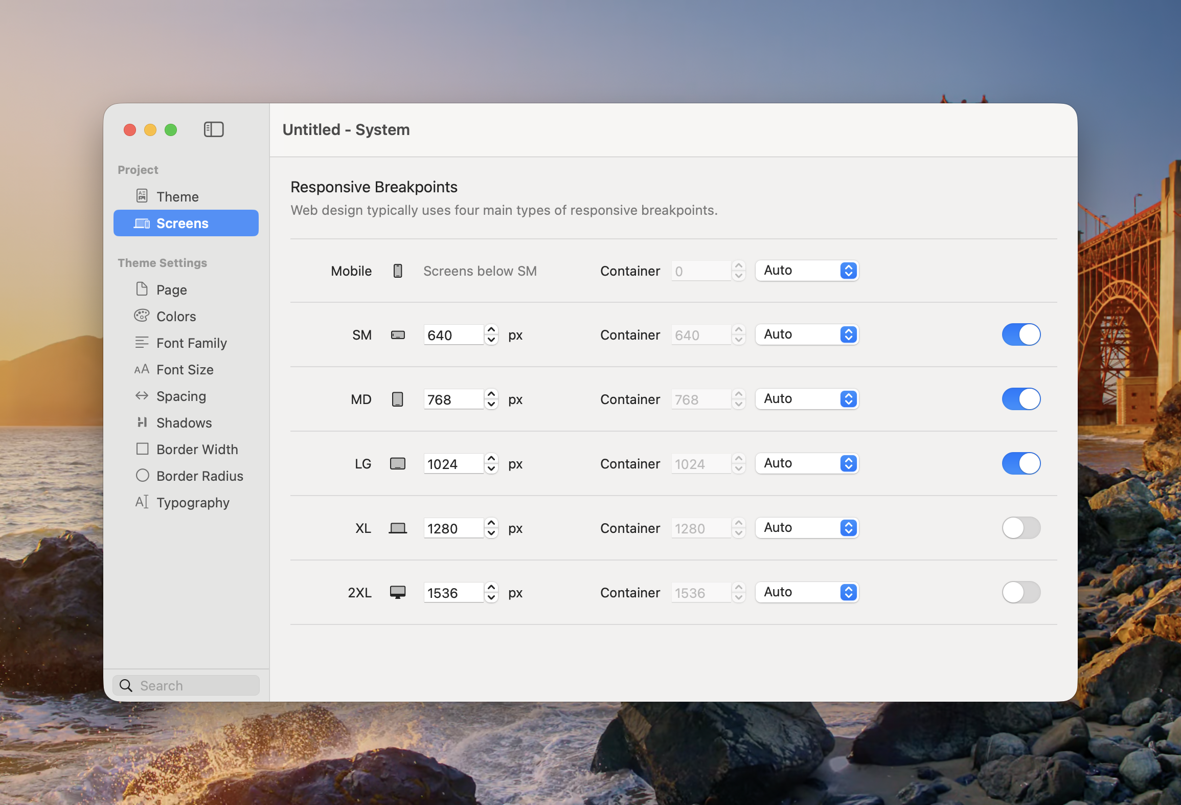
Screens defines the responsive breakpoints and container widths used throughout the project. Components with responsive controls inherit these screen sizes.
Each screen can define a breakpoint, a container width, and whether that breakpoint is active.
### Default Breakpoints
| Screen | Starts at | Typical use |
| ---------- | --------: | --------------------------------------------- |
| **Mobile** | Below SM | Base design for phones and all smaller widths |
| **SM** | 640px | Large phones and small tablets |
| **MD** | 768px | Tablets |
| **LG** | 1024px | Laptops and smaller desktops |
| **XL** | 1280px | Wide desktop layouts |
| **2XL** | 1536px | Extra-wide desktop layouts |
Mobile is the base screen and does not need its own minimum width. Values set at Mobile apply everywhere until they are overridden at a larger enabled breakpoint.
### Configure a Screen
For each named screen:
* **Breakpoint** — Sets the viewport width at which the screen begins.
* **Container** — Sets the project-wide maximum container width at that screen. Auto keeps Mobile fluid and uses the screen width for the named breakpoints; choose a custom value when the layout needs a narrower content width.
* **Enabled** — Makes the breakpoint available to responsive component controls. Disable breakpoints you do not intend to design for.
Keep breakpoint values in ascending order. A larger screen should not begin before the screen listed above it.
{% hint style="info" %}
Most projects do not need every breakpoint. A smaller set of deliberate breakpoints is often easier to maintain than separate overrides for every screen size.
{% endhint %}
### Mobile-First Behaviour
Elements uses a mobile-first cascade:
1. Design the Mobile appearance first.
2. Move to the next enabled screen.
3. Add an override only where the layout needs to change.
4. That override continues to larger screens until another breakpoint changes it.
See [Breakpoints](/elements-docs/using-elements/design-and-theming/responsive-breakpoints.md) for an explanation of the responsive override indicators used in the component Inspector.
### Container Widths
Container widths control components that use the project’s shared container sizing. They do not force every component to that width; a component must be configured to use the container value.
{% embed url="" %}
---
# Agent Instructions
This documentation is published with GitBook. GitBook is the documentation platform designed so that both humans and AI agents can read, navigate, and reason over technical content effectively. Learn more at gitbook.com.
## Querying This Documentation
If you need additional information that is not directly available in this page, you can query the documentation by asking a question.
Perform an HTTP GET request on the following URL with the `ask` and `goal` query parameters:
```
GET https://docs.realmacsoftware.com/elements-docs/using-elements/design-and-theming/theme-studio/screens.md?ask=&goal=
```
`ask` is the immediate question: it should be specific, self-contained, and written in natural language.
`goal` is what the user is ultimately trying to achieve, the reason they need the answer. Sharing it helps GitBook give you a better, more relevant answer. A goal is most helpful when it describes the outcome the user wants rather than restating the question. For example, with `ask=how do I create an API token`, a goal like `automate deployments from our CI pipeline` lets GitBook tailor the answer to that use case.
The response will contain a direct answer to the question and relevant excerpts and sources from the documentation.
Use this mechanism when the answer is not explicitly present in the current page, you need clarification or additional context, or you want to retrieve related documentation sections.