> For the complete documentation index, see [llms.txt](https://docs.realmacsoftware.com/elements-docs/llms.txt). Markdown versions of documentation pages are available by appending `.md` to page URLs; this page is available as [Markdown](https://docs.realmacsoftware.com/elements-docs/using-elements/design-and-theming/theme-studio/shadows.md).
# Shadows
Create reusable shadow styles for depth and emphasis
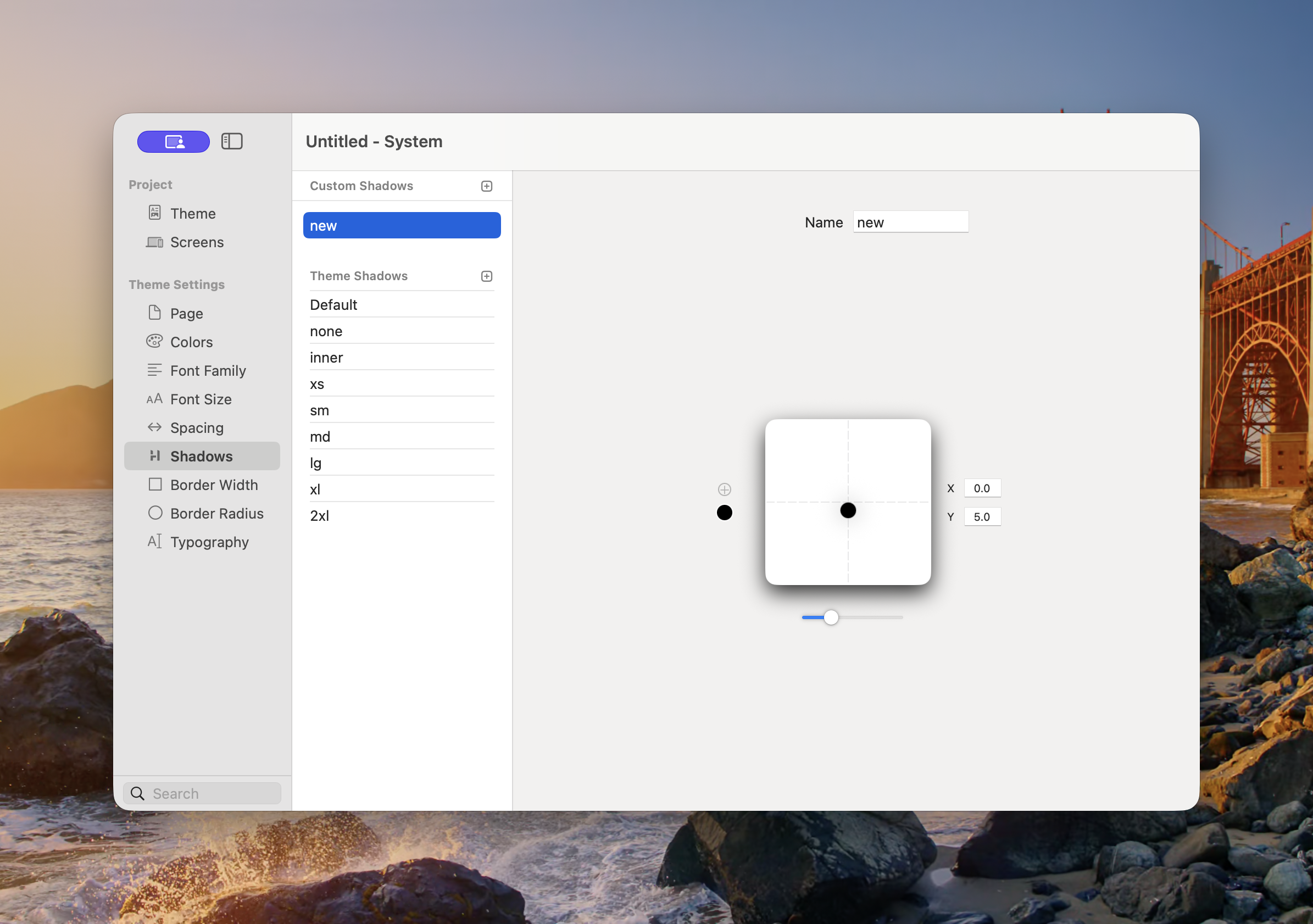
Shadows defines the reusable shadow treatments available to Components. Use them to separate cards from a background, raise interactive elements, create inset surfaces, or establish a consistent sense of depth.
The editor provides a live preview while you adjust the shadow.
### Custom and Theme Shadows
* **Custom Shadows** — Project-specific styles added with the plus button.
* **Theme Shadows** — Styles inherited from the selected theme.
The standard theme names are:
* **Default** — The theme’s recommended general-purpose shadow.
* **none** — Removes the shadow.
* **inner** — Draws the shadow inside the element.
* **xs**, **sm**, **md**, **lg**, **xl**, and **2xl** — Progressively stronger depth treatments.
The exact appearance can vary between themes. For example, one theme may use soft diffused shadows while another uses sharp, offset shadows.
### Create a Custom Shadow
1. Open **Theme Studio → Shadows**.
2. Select the plus button beside Custom Shadows.
3. Enter a descriptive **Name**.
4. Drag the point in the preview or enter **X** and **Y** offsets.
5. Adjust the blur or softness control.
6. Choose the shadow colour and opacity.
7. Add another shadow layer when the design requires a more natural combined effect.
The preview updates as you work. Apply the finished shadow through a Component’s Shadow or Effects controls.
### Choosing a Shadow
Start with **Default** for general cards and controls. Use smaller shadows for subtle separation and larger shadows for overlays or floating elements. Use **inner** only when the visual treatment should appear recessed.
{% hint style="warning" %}
Large, dark shadows can reduce clarity and make a layout feel inconsistent. Use a small number of repeated depth levels across the project.
{% endhint %}
### Accessibility and Design
* Do not rely on shadow alone to show keyboard focus.
* Make sure controls remain understandable when shadows are subtle or unavailable.
* Check shadows in both light and dark appearance.
* Use sufficient contrast between an element and its background before adding a shadow.
See [Common Controls → Effects](/elements-docs/using-elements/components/common-controls/effects.md) for applying theme shadows to Components.
---
# Agent Instructions
This documentation is published with GitBook. GitBook is the documentation platform designed so that both humans and AI agents can read, navigate, and reason over technical content effectively. Learn more at gitbook.com.
## Querying This Documentation
If you need additional information that is not directly available in this page, you can query the documentation by asking a question.
Perform an HTTP GET request on the following URL with the `ask` and `goal` query parameters:
```
GET https://docs.realmacsoftware.com/elements-docs/using-elements/design-and-theming/theme-studio/shadows.md?ask=&goal=
```
`ask` is the immediate question: it should be specific, self-contained, and written in natural language.
`goal` is what the user is ultimately trying to achieve, the reason they need the answer. Sharing it helps GitBook give you a better, more relevant answer. A goal is most helpful when it describes the outcome the user wants rather than restating the question. For example, with `ask=how do I create an API token`, a goal like `automate deployments from our CI pipeline` lets GitBook tailor the answer to that use case.
The response will contain a direct answer to the question and relevant excerpts and sources from the documentation.
Use this mechanism when the answer is not explicitly present in the current page, you need clarification or additional context, or you want to retrieve related documentation sections.