> For the complete documentation index, see [llms.txt](https://docs.realmacsoftware.com/elements-docs/llms.txt). Markdown versions of documentation pages are available by appending `.md` to page URLs; this page is available as [Markdown](https://docs.realmacsoftware.com/elements-docs/using-elements/design-and-theming/theme-studio/spacing.md).
# Spacing
Specify global spacing for your website
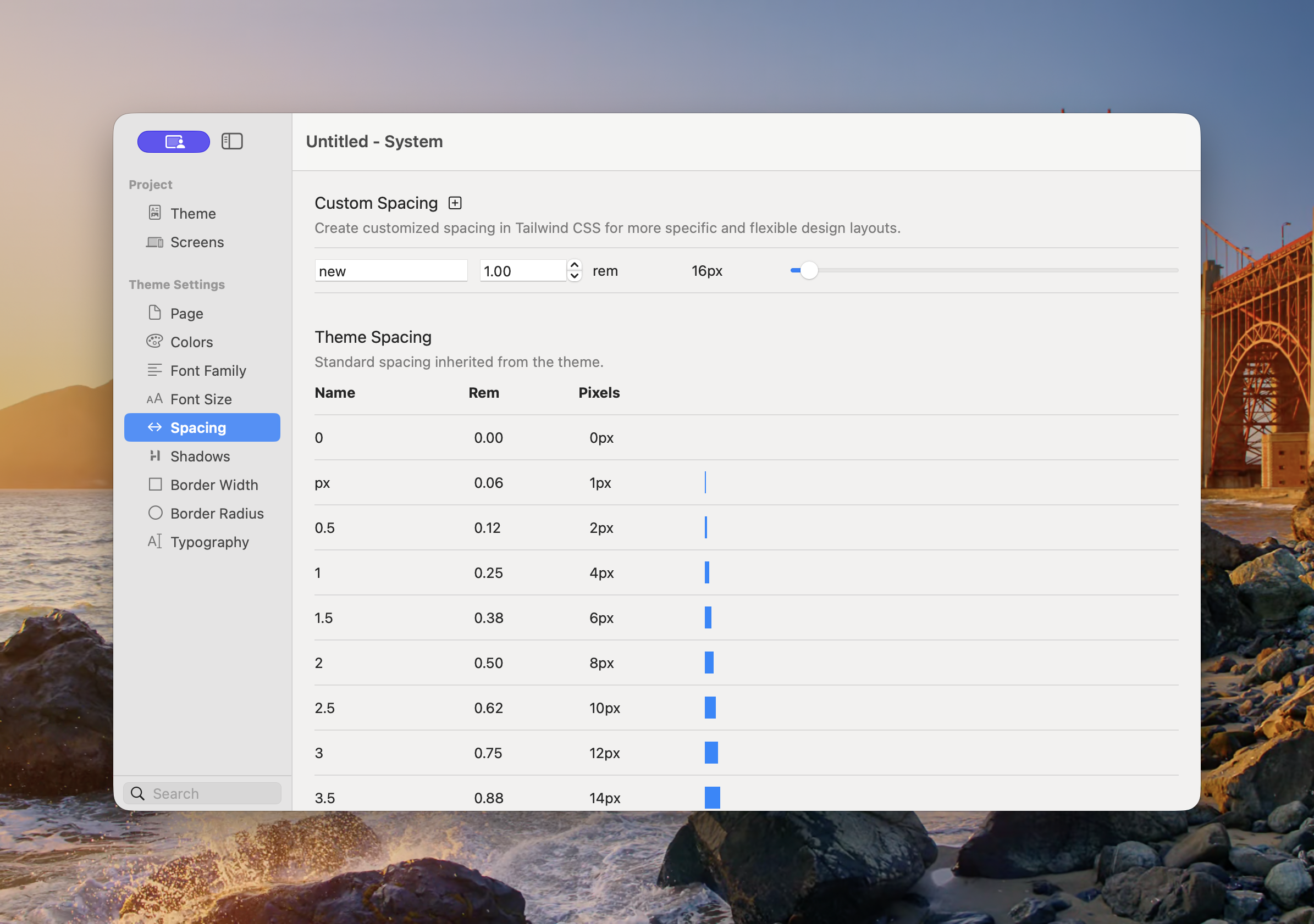
Spacing provides reusable values for gaps, padding, margins, positioning, and other layout controls. A shared scale creates consistent visual rhythm and makes site-wide adjustments easier.
The inherited scale shows each value in rem and its pixel equivalent.
### Theme Spacing
The selected theme supplies a spacing scale with familiar names such as `0`, `px`, `0.5`, `1`, `1.5`, `2`, and larger steps. Components refer to the name rather than storing a one-off measurement.
At the standard browser root size:
| Name | Rem | Pixels |
| ----- | --------: | -----: |
| `0` | 0 | 0px |
| `px` | 0.0625rem | 1px |
| `0.5` | 0.125rem | 2px |
| `1` | 0.25rem | 4px |
| `2` | 0.5rem | 8px |
| `3` | 0.75rem | 12px |
| `4` | 1rem | 16px |
The scale continues with larger values for section spacing and layout.
### Add Custom Spacing
1. Open **Theme Studio → Spacing**.
2. Select the plus button beside Custom Spacing.
3. Enter a meaningful **Name**.
4. Set the value in rem using the field, stepper, or slider.
5. Use the new value in compatible Component controls.
The pixel value shown in Theme Studio is a convenient equivalent. Elements stores the scale in rem so it remains relative to the project’s root text size.
{% hint style="info" %}
Before adding a custom value, check whether a nearby theme value will work. A smaller scale is easier to use consistently.
{% endhint %}
### Best Practices
* Use neighbouring scale values for related distances.
* Reserve large values for major section separation.
* Use smaller values for gaps inside a component.
* Keep vertical rhythm consistent across repeated sections.
* Review spacing at every enabled [Screen](/elements-docs/using-elements/design-and-theming/theme-studio/screens.md); a desktop-sized gap may be excessive on Mobile.
See [Common Controls → Spacing](/elements-docs/using-elements/components/common-controls/spacing.md) for how the shared scale is applied as margin and padding.
---
# Agent Instructions
This documentation is published with GitBook. GitBook is the documentation platform designed so that both humans and AI agents can read, navigate, and reason over technical content effectively. Learn more at gitbook.com.
## Querying This Documentation
If you need additional information that is not directly available in this page, you can query the documentation by asking a question.
Perform an HTTP GET request on the following URL with the `ask` and `goal` query parameters:
```
GET https://docs.realmacsoftware.com/elements-docs/using-elements/design-and-theming/theme-studio/spacing.md?ask=&goal=
```
`ask` is the immediate question: it should be specific, self-contained, and written in natural language.
`goal` is what the user is ultimately trying to achieve, the reason they need the answer. Sharing it helps GitBook give you a better, more relevant answer. A goal is most helpful when it describes the outcome the user wants rather than restating the question. For example, with `ask=how do I create an API token`, a goal like `automate deployments from our CI pipeline` lets GitBook tailor the answer to that use case.
The response will contain a direct answer to the question and relevant excerpts and sources from the documentation.
Use this mechanism when the answer is not explicitly present in the current page, you need clarification or additional context, or you want to retrieve related documentation sections.