> For the complete documentation index, see [llms.txt](https://docs.realmacsoftware.com/elements-docs/llms.txt). Markdown versions of documentation pages are available by appending `.md` to page URLs; this page is available as [Markdown](https://docs.realmacsoftware.com/elements-docs/using-elements/design-and-theming/theme-studio/typography.md).
# Typography
Style paragraphs, headings, lists, quotes, code, and links as a reusable system
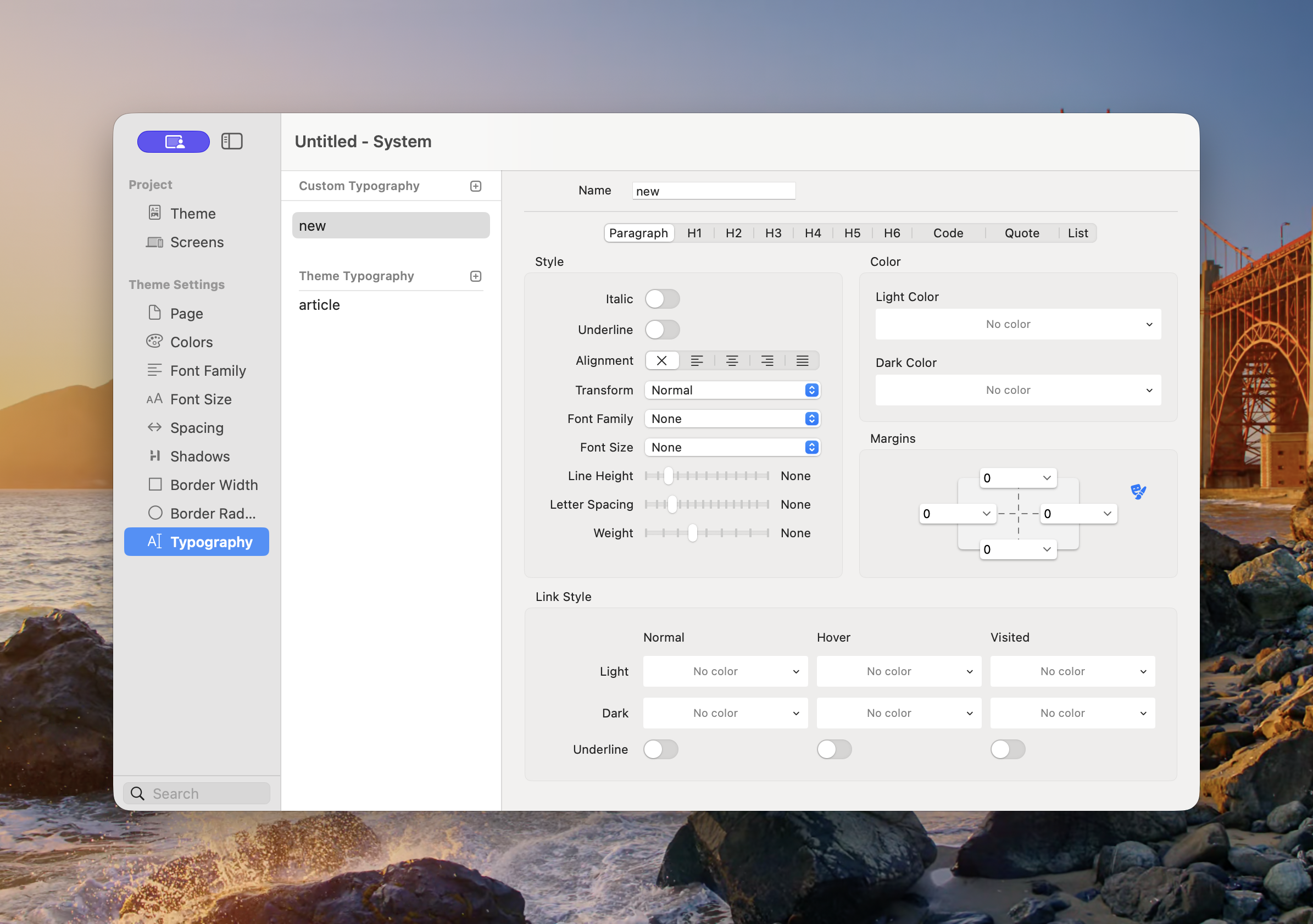
Typography combines the project’s fonts, sizes, colours, alignment, spacing, and link treatments into reusable presets. A preset can style all the common text elements in long-form content when using the Typography Component.
Each tab controls one type of content within the selected typography preset.
### Custom and Theme Typography
* **Custom Typography** — Presets created for the current project.
* **Theme Typography** — Presets inherited from the selected theme. The standard preset is named **article**.
Use a custom preset when the project needs more than one long-form treatment, such as separate styles for articles, legal pages, or compact documentation.
### Create a Typography Preset
1. Open **Theme Studio → Typography**.
2. Select the plus button beside Custom Typography.
3. Give the preset a descriptive **Name**.
4. Work through each content tab.
5. Apply the preset to a Component that provides a Typography control.
6. Test realistic content containing headings, paragraphs, lists, links, quotes, and code.
### Content Tabs
The preset provides separate settings for:
* **Paragraph**
* **H1**, **H2**, **H3**, **H4**, **H5**, and **H6**
* **Code**
* **Quote**
* **List**
These tabs style the corresponding content elements. They do not change the semantic heading level in the page content.
### Style
Depending on the selected content type, the Style group can include:
* **Italic** and **Underline**
* **Alignment** — Inherit, Left, Centre, Right, or Justify
* **Transform** — Controls text case
* **Font Family** — Uses a family from [Font Family](/elements-docs/using-elements/design-and-theming/theme-studio/font-family.md)
* **Font Size** — Uses a value from [Font Size](/elements-docs/using-elements/design-and-theming/theme-studio/font-style.md)
* **Line Height**
* **Letter Spacing**
* **Weight**
Choose inherited or unset values when a property should follow the surrounding component rather than forcing an override.
### Colour
Set separate Light and Dark text colours. Choose a semantic palette and shade from [Colors](/elements-docs/using-elements/design-and-theming/theme-studio/colors.md), then verify contrast against the backgrounds where the typography will be used.
### Margins
Margins control the space around each content type. Set Top, Right, Bottom, and Left values from the [Spacing](/elements-docs/using-elements/design-and-theming/theme-studio/spacing.md) scale. Link sides when they should change together, or unlink them for individual control.
Paragraph and heading margins are especially important in long-form content. Test consecutive headings, lists after paragraphs, nested content, and the final element in a text block.
### Link Style
Typography can define link treatment for three states:
* **Normal**
* **Hover**
* **Visited**
Each state supports separate Light and Dark colours and its own underline setting. Do not rely on colour alone: underlines provide a clear visual distinction between links and surrounding text.
### Accessibility
* Keep heading levels in a logical order in the content.
* Use comfortable body size and line height.
* Avoid justified alignment when it creates uneven spacing that is difficult to read.
* Make links identifiable without relying only on colour.
* Check every text and link state in light and dark appearance.
* Do not use text transformation as a substitute for writing content with the intended capitalisation.
### Dev Diary Videos for Typography
The following video introduces typography in Elements. It was recorded with a development version, so the current interface may differ slightly.
{% embed url="" %}
---
# Agent Instructions
This documentation is published with GitBook. GitBook is the documentation platform designed so that both humans and AI agents can read, navigate, and reason over technical content effectively. Learn more at gitbook.com.
## Querying This Documentation
If you need additional information that is not directly available in this page, you can query the documentation by asking a question.
Perform an HTTP GET request on the following URL with the `ask` and `goal` query parameters:
```
GET https://docs.realmacsoftware.com/elements-docs/using-elements/design-and-theming/theme-studio/typography.md?ask=&goal=
```
`ask` is the immediate question: it should be specific, self-contained, and written in natural language.
`goal` is what the user is ultimately trying to achieve, the reason they need the answer. Sharing it helps GitBook give you a better, more relevant answer. A goal is most helpful when it describes the outcome the user wants rather than restating the question. For example, with `ask=how do I create an API token`, a goal like `automate deployments from our CI pipeline` lets GitBook tailor the answer to that use case.
The response will contain a direct answer to the question and relevant excerpts and sources from the documentation.
Use this mechanism when the answer is not explicitly present in the current page, you need clarification or additional context, or you want to retrieve related documentation sections.