> For the complete documentation index, see [llms.txt](https://docs.realmacsoftware.com/elements-docs/llms.txt). Markdown versions of documentation pages are available by appending `.md` to page URLs; this page is available as [Markdown](https://docs.realmacsoftware.com/elements-docs/using-elements/store-components/before-after-paid.md).
# Before After (Paid)
Compare two images or sets of content with an interactive slider
{% hint style="success" %}
Before After is available as a **paid product via the Elements Store**. Install the current version of Elements before adding it to a project.
{% endhint %}
Before After creates an interactive comparison that visitors can drag to reveal more or less of two images or two sets of components. It is ideal for photo edits, renovations, product comparisons, design revisions, and any situation where the difference is easier to understand visually.
The comparison can run horizontally or vertically, use a fixed or responsive height, and animate on hover or automatically. Content mode also lets you compare complete layouts rather than images alone.
Purchase Before After
{% embed url="" %}
### Features
* **Image and content modes** — Compare two images or place any Elements components on either side.
* **Flexible sizing** — Use an aspect ratio, a fixed height, or let the content determine the height.
* **Horizontal and vertical reveals** — Match the movement to the subject being compared.
* **Optional animation** — Animate on hover or move the divider automatically.
* **Custom divider and handle** — Set the starting position, thickness, colour, and handle visibility.
* **Touch-friendly interaction** — Visitors can drag the comparison on desktop and touch devices.
### Requirements
Before using Before After, make sure you have:
* The Before After pack installed from the Elements Store.
* Two suitable images, or two sets of child components when using Content mode.
{% hint style="warning" %}
Both sides should describe the same subject from a closely matched viewpoint. Large differences in dimensions or composition can make the comparison difficult to understand.
{% endhint %}
### Supported Content and File Types
Before After supports:
* Two image resources supported by Elements.
* Any Elements components placed in the Before and After dropzones.
* Responsive image and component-based comparisons.
### How to Use Before After
You’ll find Before After under **Media** in the Components list.
1. Drag **Before After** onto the page.
2. Choose **Images** or **Content** from the Mode setting.
3. Add the Before and After images, or place components into the two content dropzones.
4. Choose a Height Mode and Orientation.
5. Set the divider’s starting position and decide whether to show the handle.
6. Preview the page and test the comparison with a pointer and on a touch device.
### Component Settings
#### Before After
**Height Mode**
Controls how the component calculates its height.
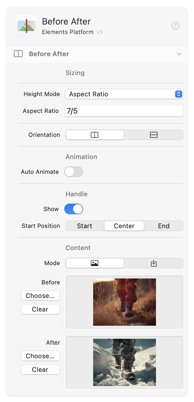
* **Aspect Ratio** — Keeps the component at the selected proportion as its width changes. The default ratio is `7/5`.
* **Fixed Height** — Uses a height in pixels. The default is `500px`.
* **Dynamic (Content)** — Lets the child content determine the final height. The Initial Height setting provides a `500px` starting height while the content is being measured.
**Orientation**
* **Horizontal** — The divider moves from left to right.
* **Vertical** — The divider moves from top to bottom.
**Animate**
* **Off** — The divider only moves when a visitor drags it.
* **Hover** — The reveal follows the visitor’s hover position.
* **Auto** — The divider animates automatically.
When Hover or Auto is selected, **Duration** controls the animation time in seconds. The default is 3 seconds.
**Divider**
* **Start Position** — Sets the initial reveal point. The default is 50%.
* **Width / Height** — Controls divider thickness. Width appears for horizontal comparisons and Height appears for vertical comparisons.
* **Color** — Sets the divider colour.
* **Handle** — Shows or hides the draggable handle.
**Mode**
* **Images** — Displays the selected Before and After image resources.
* **Content** — Provides separate dropzones for complete component layouts.
In Content mode, **View In Edit** switches between the Before and After sides while you work in the editor.
{% columns %}
{% column width="50%" %}
#### Advanced
Use **Classes** to add custom CSS classes and **ID** to assign a unique HTML identifier.
{% endcolumn %}
{% column width="50%" %}
The Before After settings in the Inspector.
{% endcolumn %}
{% endcolumns %}
### Accessibility
* Give both images useful descriptions in Resources. Describe the meaningful difference rather than repeating “before” and “after”.
* Keep the divider and handle visible with sufficient contrast so the interaction is easy to discover.
* Do not use the comparison as the only way to communicate essential information; include a short text explanation nearby.
* Avoid automatic movement when it is not necessary, and test the finished page with touch and pointer input.
### Tips and Best Practices
* **Match the source images:** Use the same crop, dimensions, and camera position for the clearest comparison.
* **Start near the centre:** A 50% starting position shows that both sides are available.
* **Use Content mode deliberately:** Keep the two layouts similar in size, especially when using Dynamic height.
* **Optimise images:** Resize and compress large originals before publishing.
### Troubleshooting
#### The component jumps or changes height
Use Aspect Ratio or Fixed Height when the two sides have different dimensions. In Content mode, also make sure both layouts have predictable heights.
#### The divider is difficult to see
Choose a divider colour that contrasts with both sides, increase its width or height, and enable the handle.
#### Only one content side is visible in the editor
Use **View In Edit** to switch between Before and After. Both sides appear in the published comparison.
### Related Components
* [Image Slider](/elements-docs/using-elements/components/content-and-media/image-slider.md) — Present several images as a sequence rather than comparing two layers.
* [Image](/elements-docs/using-elements/components/content-and-media/image.md) — Add and optimise individual image resources.
| Common Control | Description |
| ------------------------------------------------------------------------------------------------------------------ | ----------------------------------------------------------------------- |
| [Link](/elements-docs/using-elements/components/common-controls/link.md) | Link to a page, resource, anchor, email address, or website. |
| [Layout](/elements-docs/using-elements/components/common-controls/layout.md) | Control positioning, stacking, visibility, overflow, and isolation. |
| [Sizing](/elements-docs/using-elements/components/common-controls/sizing.md) | Set width, height, and responsive size constraints. |
| [Spacing](/elements-docs/using-elements/components/common-controls/spacing.md) | Add responsive margin and padding. |
| [Typography & Text Styles](/elements-docs/using-elements/components/common-controls/typography-and-text-styles.md) | Control fonts, text spacing, decoration, colour, and semantic wrappers. |
| [Backgrounds](/elements-docs/using-elements/components/common-controls/backgrounds.md) | Apply colour, image, gradient, SVG, video, and hover backgrounds. |
| [Transitions](/elements-docs/using-elements/components/common-controls/transitions.md) | Choose what animates and set its timing curve, duration, and delay. |
| [Effects](/elements-docs/using-elements/components/common-controls/effects.md) | Apply shadows, opacity, and hover effects. |
| [Filters](/elements-docs/using-elements/components/common-controls/filters.md) | Apply blur, brightness, saturation, shadow, and backdrop effects. |
| [Transforms](/elements-docs/using-elements/components/common-controls/transforms.md) | Scale, rotate, move, and skew components. |
| [Borders](/elements-docs/using-elements/components/common-controls/borders.md) | Set border style, colour, opacity, width, radius, and hover states. |
| [Advanced](/elements-docs/using-elements/components/common-controls/advanced.md) | Add CSS classes and IDs, or change supported HTML tags. |
---
# Agent Instructions
This documentation is published with GitBook. GitBook is the documentation platform designed so that both humans and AI agents can read, navigate, and reason over technical content effectively. Learn more at gitbook.com.
## Querying This Documentation
If you need additional information that is not directly available in this page, you can query the documentation by asking a question.
Perform an HTTP GET request on the following URL with the `ask` and `goal` query parameters:
```
GET https://docs.realmacsoftware.com/elements-docs/using-elements/store-components/before-after-paid.md?ask=&goal=
```
`ask` is the immediate question: it should be specific, self-contained, and written in natural language.
`goal` is what the user is ultimately trying to achieve, the reason they need the answer. Sharing it helps GitBook give you a better, more relevant answer. A goal is most helpful when it describes the outcome the user wants rather than restating the question. For example, with `ask=how do I create an API token`, a goal like `automate deployments from our CI pipeline` lets GitBook tailor the answer to that use case.
The response will contain a direct answer to the question and relevant excerpts and sources from the documentation.
Use this mechanism when the answer is not explicitly present in the current page, you need clarification or additional context, or you want to retrieve related documentation sections.